Wevise Design

Led Wevise Design Systems creation, including foundations, 290 components, documentation and establishing processes.

Overview

Context

I spearheaded the creation of a comprehensive design system from the ground up. This strategic project was aimed at harmonizing our product’s visual and functional elements, thereby ensuring uniformity, efficiency, and scalability across all platforms and teams.

Role

I was the Lead Product Designer at Wevise. I collaborated with multiple designers, engineers, and PMs. I led the creation of this system from conception to launch by getting buy-in from the CTO, Director of Product, and CEO. Through extensive research, I established a comprehensive style guide and developed a library of reusable UI components that leverage Google's Material Design System for guiding principles and MUI guidelines to provide us with initial velocity and out-of-the-box components.

I conducted regular workshops and feedback sessions to ensure alignment and continuous improvement. V1 of the Wevise Design System included web components designed in Figma and developed in React and Storybook, focusing on responsiveness, scalability and accessibility standards.

Time Line
Timeline: May - July 2024

Project Type
Enterprise Web App

Team
3 Designers
4 Developers
2 Project Managers

The Challenge

Before the implementation of the Wevise Design System, our product suite suffered from a lack of a unified design language. This led to inconsistencies in user interfaces and experiences across different platforms, resulting in increased development time, higher maintenance costs, and a fragmented user experience. The Wevise Design System was developed to address these challenges and provide a solution.

Old Homepage

Old Onboarding

Old Dashboard

Results


Developing a Guide

A guide for atoms, components, naming guidelines, page name guidelines, component bucket list, a11y.

Collaboration with Key Stakeholders

Collaborated with the Director of Product and CTO to strategize the development and prioritization of components. Collaborated with the CEO to learn about platform concerns and brand image issues to incorporate feedback she gathered from stakeholders and users for the colour and typography of the design system.

Established Design Process

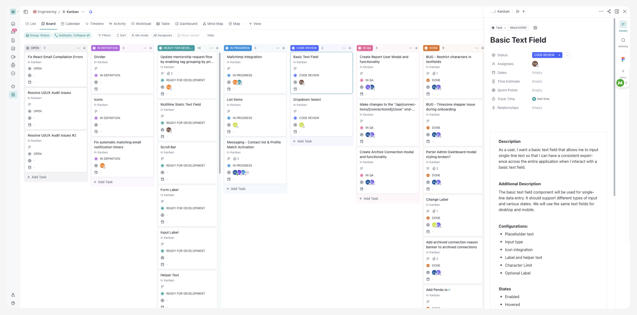
Establishing a process helped keep me on track and my collaborators in the loop by providing realistic ETAs on requests. This structured process ensured transparency and accountability in our workflow. I created a six-column workflow board to manage the design sprint and process

Streamlining Documentation

Worked with the PM and CTO to write stories about component specifications. Created a backlog of work for developers to be productive and keep them informed of all component specifications.

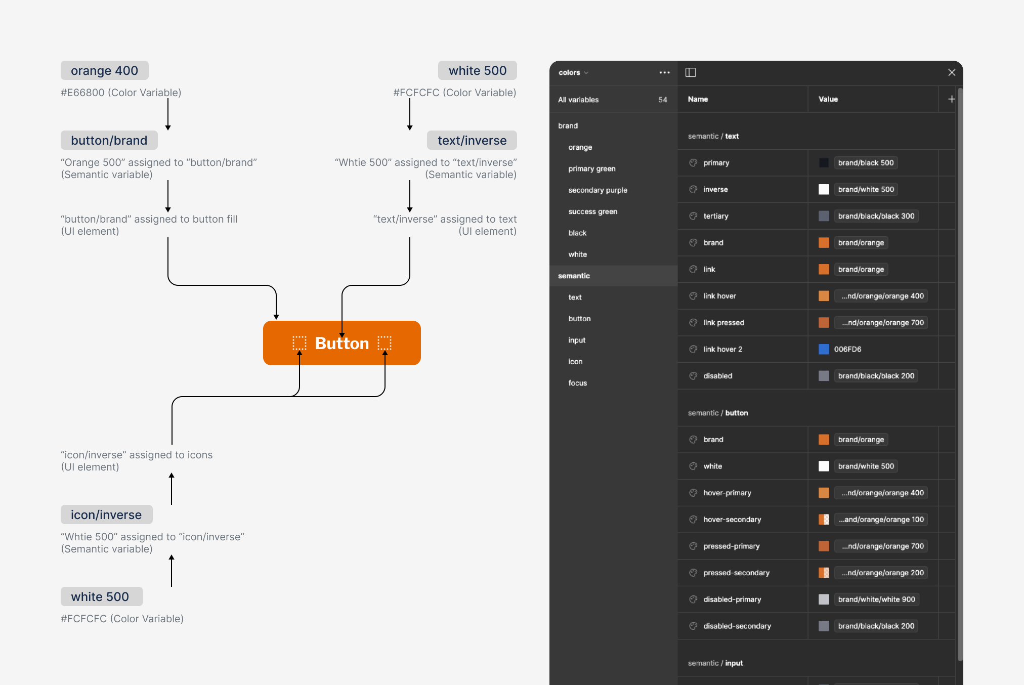
Colour Architecture

I created the naming convention and overall architecture. A screenshot of colour architecture and naming approach.

Components Designed

Button component

Checkbox, Switches, Selection Chip components

Basic, Multiline, Single Dropdown Textfield component